| Warning |
|---|
This is the documentation for Blueprint Creator version 2.x. If you are using the Blueprint Creator in version 3.x click here. |
Create your own Page Blueprint
Analogous to Confluence templates the Blueprint Creator allows you to add Page Blueprints on two levels:
- Global blueprints: These are available in every space on your site. If you have Confluence Administrator permission, you can create, edit, and promote global blueprints via the Confluence administration console. To go to the global blueprint page, choose the cog icon
 , then choose General Configuration > Global Templates and Blueprints.
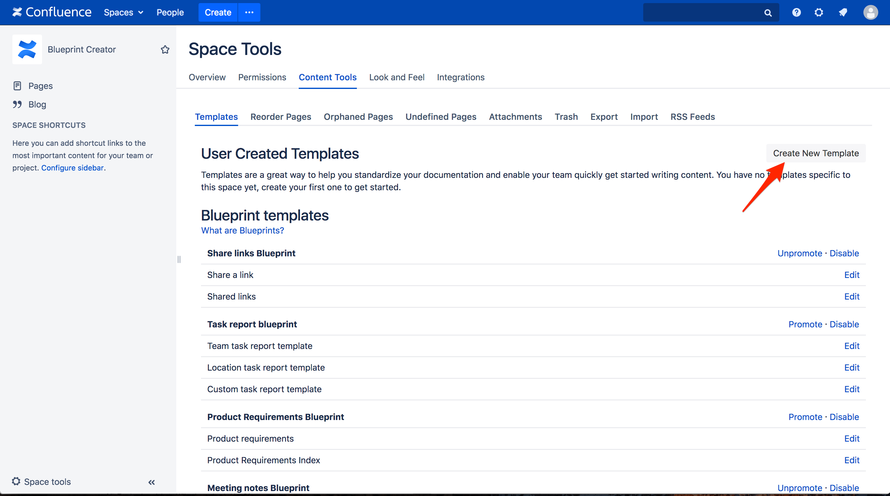
- Space templates: These are available only in the space they were created in. If you have space administrator permission, you can create, edit, and promote space templates via space tools. To go to the space templates page, choose Space tools in the sidebar, then choose Content tools > Templates.
To create a new Page Blueprint:
Go to the global template page (as described above), and click Add global page template.
Go to the space template page (as described above), and click Create New Template.
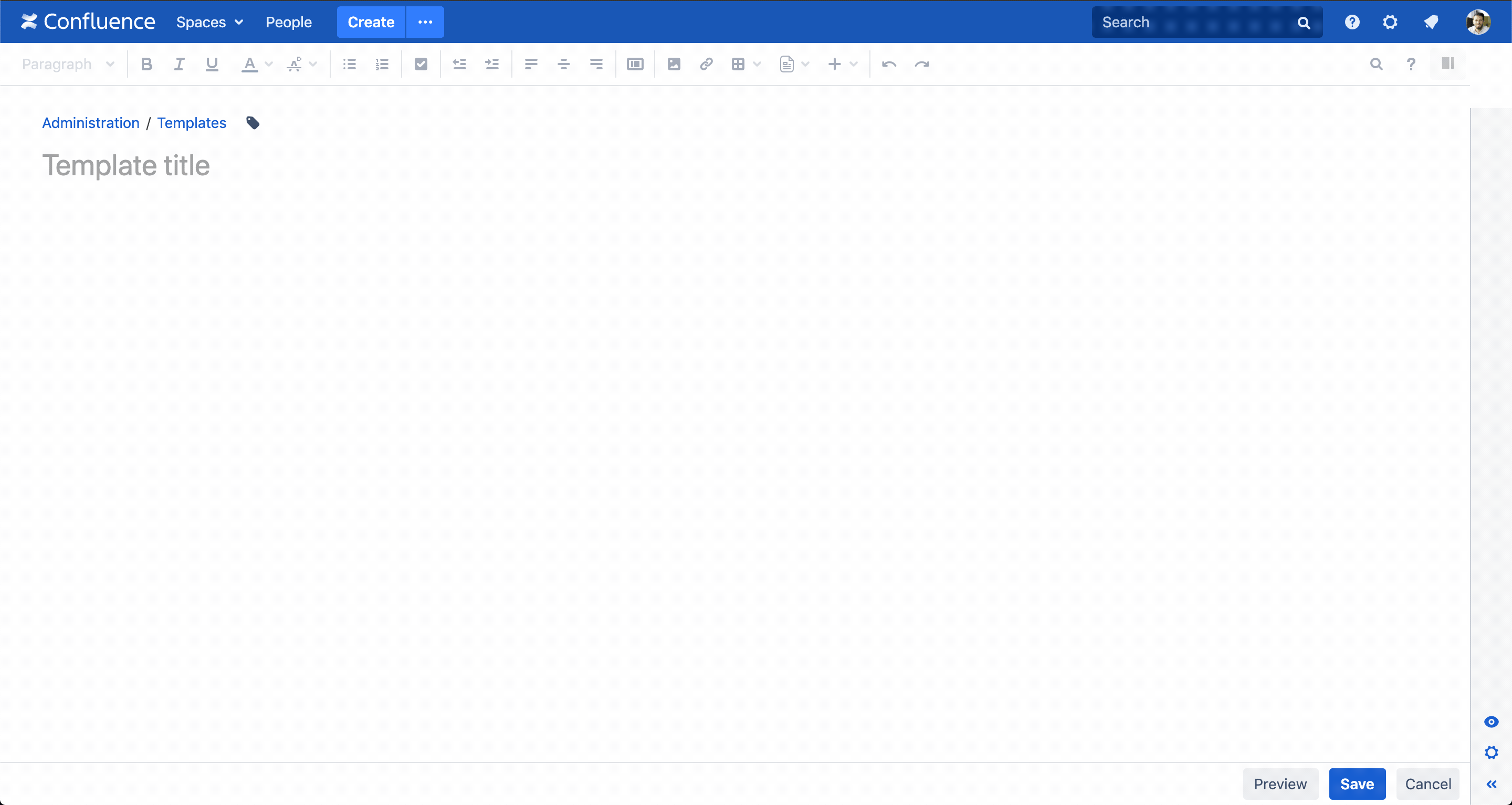
The configuration sidebar
Creating or editing a blueprint is like creating or editing a page, but with the addition of having access to a configuration panel that shows on of the side of theConfluence editor. Within there you can create multiple placeholders with different field types and configure the settings.
| Tip |
|---|
When you are busy formatting the blueprint you can simply collapse the sidebar and vice versa.
|
Adding placeholdersAnchor addingplaceholders addingplaceholders
| addingplaceholders | |
| addingplaceholders |
Placeholders act as form fields on your Page Blueprints. When someone creates a page from that Page Blueprint, they'll be prompted the Create dialog asking them to fill in the placeholder values first, before editing the page. Each data entered will be added to the page.
| Tip |
|---|
Placeholders are especially useful if one value is being used in multiple places on the blueprint, as they only need to be filled in once. |
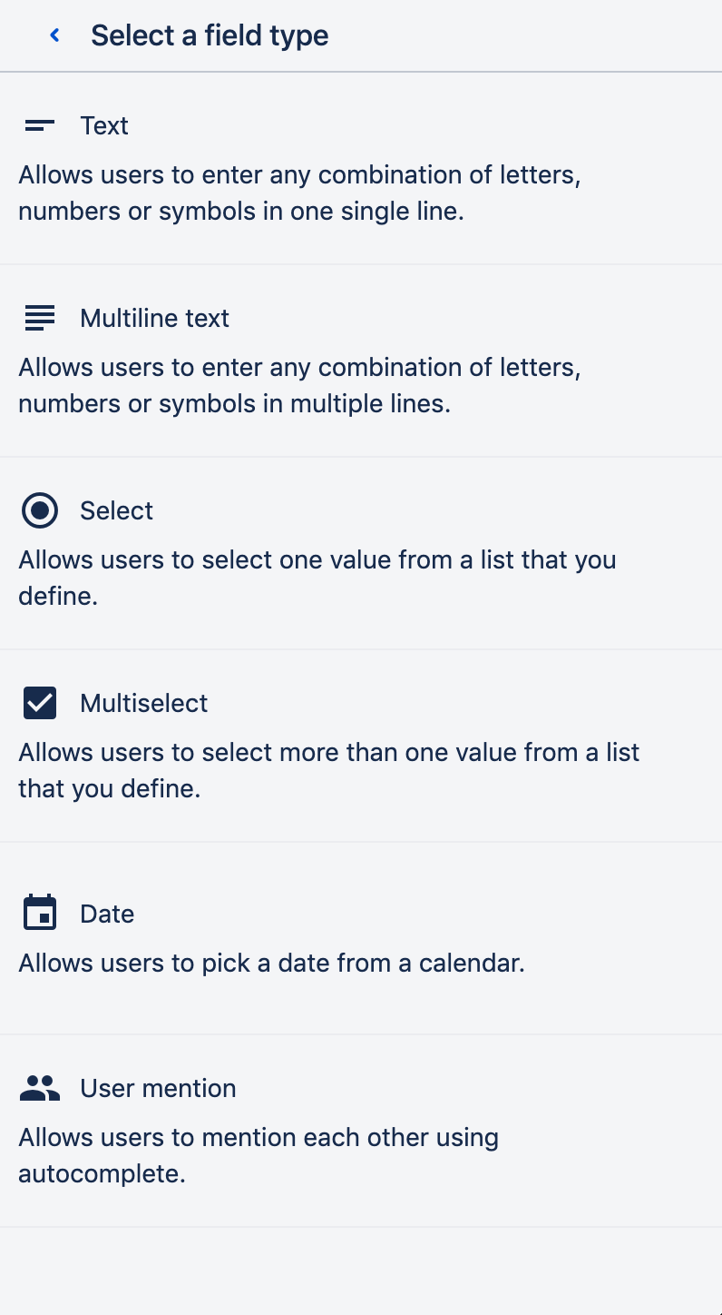
For each placeholder you create you get to choose from various field types.
| Info |
|---|
Created placeholders are displayed in the Confluence editor as blue boxes. An additional icon visualizes the chosen field type.
|
Text
Allows users to enter any combination of letters, numbers, or symbols in a single line.
Parameters
| Parameter | Description |
|---|---|
| Name | The value entered here will be shown to the user in the 'Create' dialog. |
| Description | Shows in the form field within the 'Create' dialog. |
| Mark as mandatory | Makes user entry non-optional. Also displays a red asterisks next to the placeholder in the blueprint form. |
| Hide in editor | User entry will not be shown in the editor. |
| Set as page title | User entry will be used as page title. |
Multiline text
Allows users to enter any combination of letters, numbers, or symbols on multiple lines.
Parameters
Parameter | Description |
|---|---|
| Name | The value entered here will be shown to the user in the 'Create' dialog. |
| Description | Shows in the form field within the 'Create' dialog. |
| Mark as mandatory | Makes user entry non-optional. Also displays a red asterisks next to the placeholder in the blueprint form. |
| Hide in editor | User entry will not be shown in the editor. |
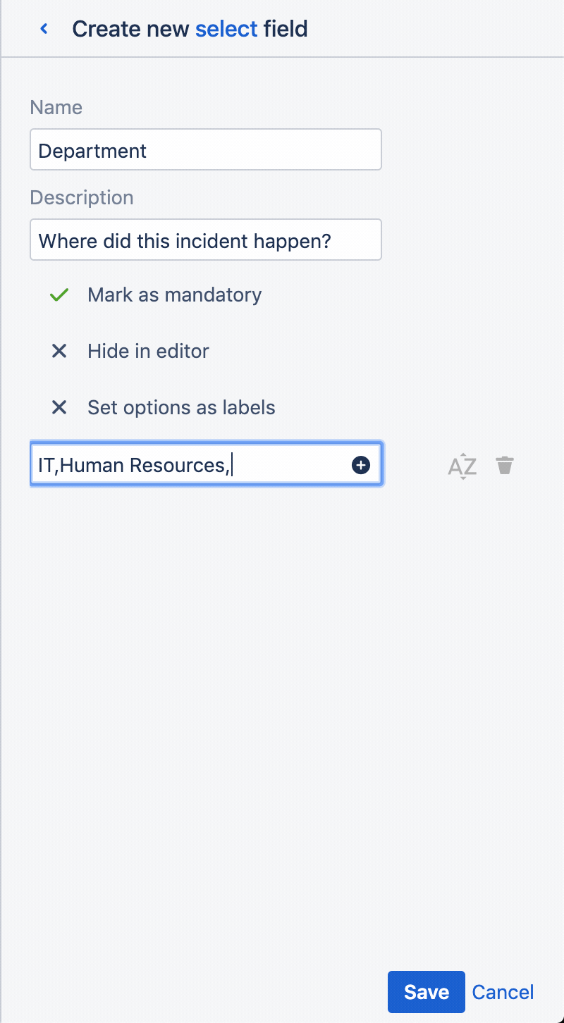
Select
Allows users to select one value from a list that you define.
Parameters
| Parameter | Description |
|---|---|
| Name | The value entered here will be shown to the user in the 'Create' dialog. |
| Description | Shows in the form field within the 'Create' dialog. |
| Options | Values users get to select from. Options can be ordered via drag and drop. |
| Mark as mandatory | Makes user entry non-optional. Also displays a red asterisks next to the placeholder in the blueprint form. |
| Hide in editor | User entry will not be shown in the editor. |
| Set selected options as labels | Options that are selected by users in the blueprint form will automatically be added as labels to the page.
Special characters include the following: ':', ';', ',', '.', ' ', '?', '&', '[', ']', '(', ')', '#', '^', '*', '@', '!', '<', '>' |
| Tip |
|---|
You can enter multiple options at once by entering a comma separated list of values.
By clicking on the icon next to the input field you can sort entered values alphanummerically. |
Multiselect
Allows users to select more than one value from a list that you define.
| Section | ||||||||||||
|---|---|---|---|---|---|---|---|---|---|---|---|---|
|
Parameters
| Parameter | Description |
|---|---|
| Name | The value entered here will be shown to the user in the 'Create' dialog. |
| Description | Shows in the form field within the 'Create' dialog. |
| Options | Values users get to select from. Options can be ordered via drag and drop. |
| Mark as mandatory | Makes user entry non-optional. Also displays a red asterisks next to the placeholder in the blueprint form. |
| Hide in editor | User entry will not be shown in the editor. |
| Set selected options as labels | Options that are selected by users in the blueprint form will automatically be added as labels to the page.
Special characters include the following: ':', ';', ',', '.', ' ', '?', '&', '[', ']', '(', ')', '#', '^', '*', '@', '!', '<', '>' |
Date
Allows users to pick a date from a popup calendar.
Parameters
| Parameter | Description |
|---|---|
| Name | The value entered here will be shown to the user in the 'Create' dialog. |
| Description | Shows in the form field within the 'Create' dialog. |
| Mark as mandatory | Makes user entry non-optional. Also displays a red asterisks next to the placeholder in the blueprint form. |
| Hide in editor | User entry will not be shown in the editor. |
User mention
Allows users to mention each other using autocomplete.
| Section | ||||||||||||
|---|---|---|---|---|---|---|---|---|---|---|---|---|
|
Parameters
| Parameter | Description |
|---|---|
| Name | The value entered here will be shown to the user in the 'Create' dialog. |
| Description | Shows in the form field within the 'Create' dialog. |
| Enable multi-user mention | Enabling users to mention more than one user. |
| Section | ||||||||||||
|---|---|---|---|---|---|---|---|---|---|---|---|---|
|
Created placeholders
Created placeholders are displayed in the sidebar where they can re-arranged via drag and drop. By clicking on placeholders you can edit them.
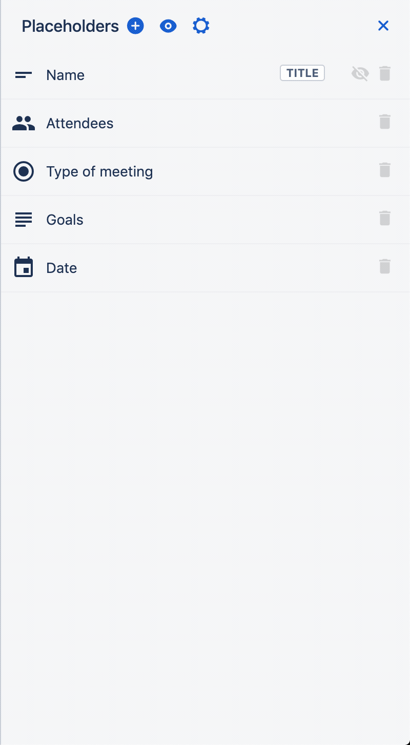
All created placeholders are also shown as blue boxes in the editor unless you specifically choose to hide them.
Preview
The preview button on the top of the configuration sidebar allows you take a look at the 'Create' dialog anytime you want while you are creating your blueprint.
Deleting placeholders
Once created placeholders that are not required anymore can be easily deleted. Just navigate to the placeholder in the editor and press the 'Backspace' key. Alternatively, you can just click on the delete icon next to the placeholder in the configuration panel.
| Section | ||||||||||||
|---|---|---|---|---|---|---|---|---|---|---|---|---|
|
Other field types
As of now only the above mentioned are supported. However, as we continuously strive to offer you the features you require we are planning to integrate macros. These include the default Confluence macros (e.g. status) and third-party apps from the Atlassian Marketplace. If you have any requests or you are an app vendor, please let us know. 
| Panel | ||||||
|---|---|---|---|---|---|---|
On this page
|